There is a considerable amount of free stuff on the Internet: videos, pictures, apps, books, and tons of information. I've definitely viewed and downloaded my fair share of content, but I haven't really given much back in return. So I while procrastinating on a personal project, I came up with a two things people might like to use. So now I'm putting them out on the web for free, along with a brief explanation of the process behind their creation.
iOS 7 Icon Grid
<img src="https://s3.amazonaws.com/Hip_Musings/images/iOS7_App_Icon_Grid%402x.png" alt"iOS 7 App Icon Grid" />
Since iOS 7's announcement and recent release to the public, one of the greatest bits examined by app makers is the new icon style.Not only are there new standards about the use of graients and realistic elements (something Instagram chose to completely ignore but I digress) in iOS 7 but a whole template was provided by Apple for icon designers to use so all the apps on your screen have a perfect visual flow. However, "provided" is a funny word because while Apple has plenty of pictures of this template, but they never released any sort of assets for designers to actually use in the creation process, i.e. Photoshop/Illustrator or Sketch.app templates. That left it up to people like Marc Edwards of Bjango to make these assets for themselves and the community. Marc is part of the majority that still uses Photoshop as their main design tool but Sketch by Bohemian Coding is starting to gain popularity, so it's about time assets were created for that community as well.
So I took an afternoon to make my own iOS 7 Icon Grid for myself and the Sketch community, and even practice using it too.
Prior to this undertaking, I had no experience with iOS icon design and minimal experience with Android design (something left for another story about how many apps are doing this wrong). As with most new projects, I started with a little research and learned about the new dimensions for iOS icons in order created a new artboard in Sketch. Most of the design process was eyeing a picture of the template online, open side-by-side with Sketch, and experimenting with all the different elements of the grid until something cohesive stuck. I finalized the product by grabbing the .png I was viewing, dropping it into Sketch to overlay my grid with it, and tweaking my grid until they matched.


I tested the grid out by making a quick app icon using my personal logo, and tweaked that image until it worked within the grid's golden ratio.
Overall, this was an interesting exploration into the area of icon design for Apple's latest mobile operatng system. The OS is still so very young so some of the older apps feel resistant to the change-Instagram- but the lack of visual flow with the rest of the interface will leave them buried in one of the infinite folders in the depths of users' homescreens.
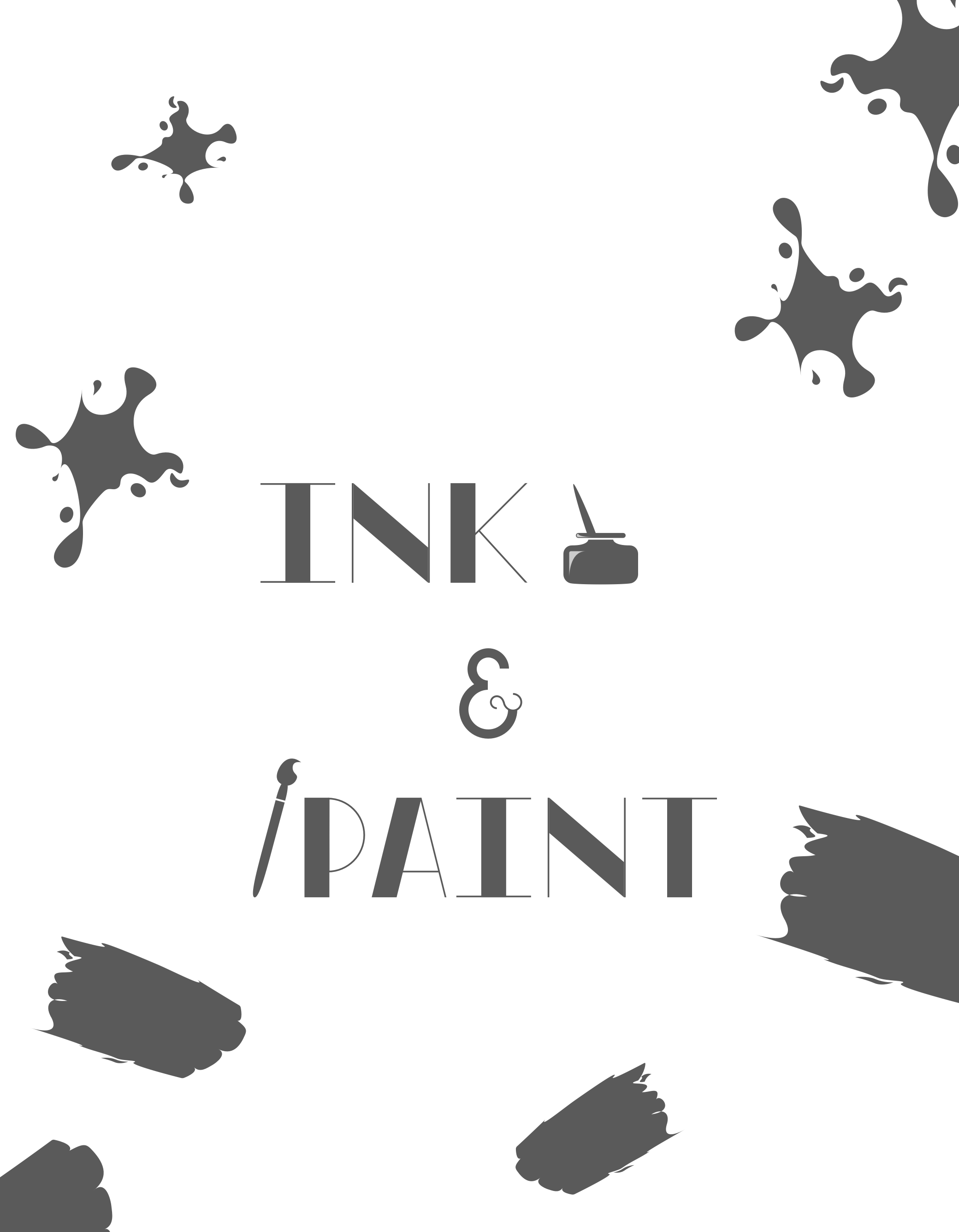
Ink & Paint iPhone Wallpaper
The second freebie started out as an idea just for a simple illustration or icon inspired by Disney animators and turned into my first experiment making wallpapers for the iPhone.

The Inking and Painting Building is a vital stop during the tour of Disney's Animation process. My typographical inspiration came from the lettering above the doors to the original buildings at the Walt Disney Studios. For other fans of the Disney creative process, I figured it would be fun to have a similar entryway to their phone.
Another technology that drew my interest for the project was the ability to create parallax backgrounds for iOS 7. Simply making your wallpapers 200 pixels longer and wider technically made them parallax-able. The real neat part of creating these types of backgrounds is adding elements that have their movements tracked as the user's phone is tilted in multiple directions. This motivated the idea of placing handmade ink splotches and brush strokes meticulously around the lettering.

The only snag I had with creating the custom typeface was the ampersand dividing INK and PAINT. Good golly miss molly, ampersands are quite the challenge for a novice at typographic design. I felt it would either make or break the message as a whole, and I certainly spent a majority of my time tweaking that one character every time I returned to the project. I eventually fell back to Google and found a great article about the History of Ampersands-- this is something I never thought I would find interest in a year ago.
I really enjoyed working on more of a static design for once, as opposed to my usual web work and worrying about the constantly varying size changes. Being able to work with several different design elements helped me find a new cohesiveness in my piece.
You can download all my freebies below, all I ask for in return is a quick share of the article so others can enjoy this content as well. Please reach out to me on Twitter or email me from my contact page if you have any comments or constructive criticism.
Thanks for reading and enjoy!